


Here’s my suggestion of how to make the buying experience on the Discogs app a little more comfortable
Discogs is the largest music database and marketplace in the world, with almost 400,000 users on both website and mobile app platforms. The main uses of Discogs are: Keeping track of the items you have in your collection, running a “wantlist” of the items you want, finding info about artists, labels, cost of items you have or want and contributing info to the database. Its vast marketplace is used for buying and selling music releases, especially vinyl records.
As a record collector and a Discogs user, I decided to challenge myself with a quick redesign of a specific flow of the current Discogs app on Android.
For this purpose I ran some user research with record collectors. I discovered 3 main types of users: 1. Buyers 2. Sellers 3. Contributors, although potentially all users can be each and every one of those types, depending on their mindset.
During my research I discovered that users were more comfortable to use the app for keeping track of their collection or wantlist but felt that the buying experience of the app was confusing and often frustrating to the point where they preferred using the website over the app for buying.
As a result, I decided to address the users with a specific intention to buy.
Users who open the app land on their profile page, which doesn’t necessarily lead to do a meaningful action. Users I talked to mentioned the fact that the app is lacking the option to discover music. so, instead of landing on their profile, an “Explore” section could be more helpful and be also a potential gate to encourage buying.
On the current Discogs app design, Marketplace access is limited to cart, past purchases or wantlist items. I suggest designing the Marketplace area as a section where users could enter and browse all of the items they would potentially be interested in buying.
Current Discogs app has only a global search where users need to search the entire database and filter their way through to get to a certain version that might interest them.
A specific search within the Marketplace that shows recent search queries and has auto-complete search results, with relevant info like price, could save the users time and unnecessary “clicks”.
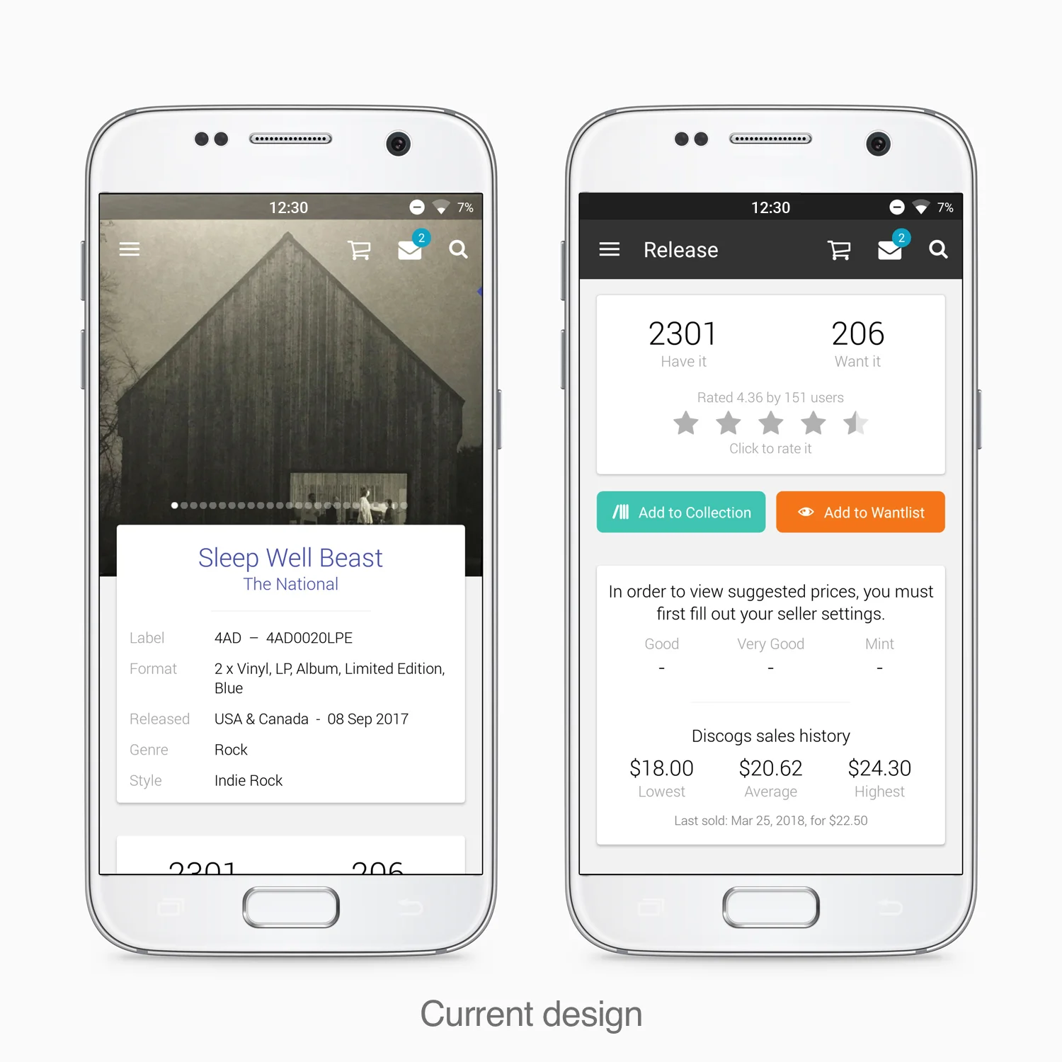
The page for a specific version of music album has a lot of info that requires a very long scroll but users also mentioned that it lacks sales history info that is crucial for deciding whether an item is worth buying or not.
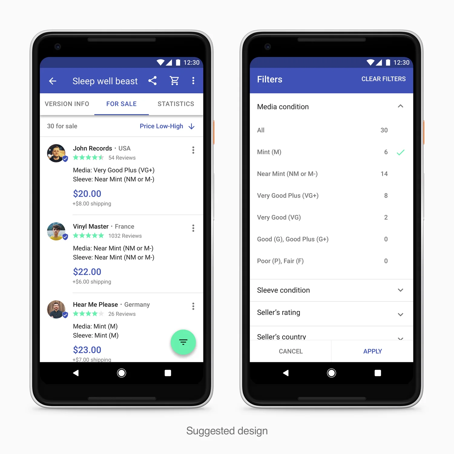
I suggest a design that has tabs for the 3 main areas: Version info, Items for sale and Statistics, which include all the missing sales info.
The most common pain that surfaced from the user research was that the items for sale section is missing a sorting mechanism and that the filtering is not working properly (you need to enter the filter query manually and often it doesn’t lead to any filtering). This problem results in making it very difficult to choose a buyer to buy the item from.
Therefore, I propose simple but effective sorting and filtering mechanism that has all the important filters: Item’s condition, Seller’s rating etc.
In the current design, users try to figure out how much they are about to pay based on the seller’s shipping info, that is often too vague and leads to users sending messages to enquire about the total cost. Furthermore, there are no guarantees that the seller would actually ship the items once the users paid for them.
Therefore, I suggest a price with the shipping cost calculated automatically by the system. Also, showing crucial info like a shield icon that represents that a seller was verified through strict criteria that meet the Discogs guidelines and also show friends of the users who might bought from this seller in the past. Furthermore, I suggest showing more items for sale based on the user’s Wantlist.
I’v created a prototype with inVision, that shows a suggested buying flow. You can view a video of the prototype below or try it for yourself if you want.
Here are a few parameters I suggest to check in order to measure if the new design I offer could help users: 1. A faster task completion time - Should indicate that users could search, filter and sort items with more ease, which led to finding the items they were interested in faster. 2. A higher task success rate - Which might Show that the buying process became less complicated. 3. An increase in conversion rate - Should indicate that more users were able to locate the items they wanted to buy.